Category Archives: Part 1

Project 3

PICKING AND PORTRAYING

What do I believe drawing to be?

I believe drawing to be a way of transferring ones thoughts from inside the mind onto a two dimensional visual media for all to see. This can be anything from using a camera to building a collage, I think that once a concept becomes three dimensional then we cross over into ‘making’. This is a fine line and one I may come back to later with a change of view point. There are many forms of drawing for different end uses, for example technical drawing, architectural engineering and visual planning for interior design and gardens along with analytical drawing as well as the individual artistic approach which has endless forms.


RESEARCH POINT 2

Jane Askey

Contemporary still life artist influenced by the decorative objects she sees on her travels. Jane’s background is in textile design and this shows through in her fresh use of colour and detailed decoration. She uses mixed media and gouache. The floral theme which is dominant and recurring in Jane’s paintings flow in much the same way as a collage does, through all of the fabric, paper and objects carefully placed together these begin to tell a story and give a sense of time and place.

Inspired by Jane Askey’s art has lead me to reflect closely on my own choice of colour and placement and how this informs the very narrative of my work.

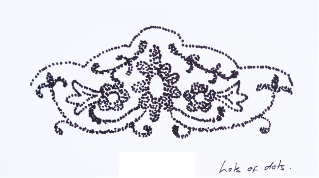
I have chosen five of Jane’s paintings as examples below. The first one  ‘Pink flowers and Polka Dots’ is my favorite. The aqua colours as a background to the bright pink flowers give me a sense of a beautiful warm spring day, the flowers are placed casually in different vases onto the table and the sketch lines are fluid and relaxed, I can imagine sitting at this table drinking a glass wine and the bees buzzing away in the background.

I wanted to gain a closer insight into the colour pallet that  Jane Askey’s has worked with on the below paintings. The colours have been pulled from the various areas of her  artwork by using the dropper  tool in ‘Photoshop CS.’  They are not perfect match colours as there are many variations within each colour when using this method, but they are enough to help me analyse and see how colour has been used. This method of analysis helps me incredibly within my work.

colour-palet-jane-askey

I always seem to be adding black line to my artwork and this can look harsh when I want my drawing to have a delicacy and  flow of the pencil line. I now see that by analysing Jane’s painting below ‘Pink flowers and polka dots’ that the pencil line can be very effective when drawn with soft colour of line.
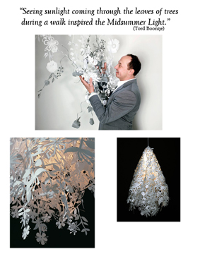
jane-askey

Tord Boontje

Tord boontje is originally from the Netherlands. He is also professor and head of design products at the royal college of art.

“I am interested in creating elements for everyday life that are exciting and uplifting to live with” (Tord Booontje)

Tord’s designs are not only one off pieces which can be found in major museum collections around the world  he also designs products for the mass market, beautiful household pieces such as tableware,lighting, furniture,fashion, jewelry and accessories. which can be found in his online shop http://www.shoptordboontje.com

I find Tord Boontje’s work a ‘Fairy tail’ each piece is absolutely enchanting and it draws me in to a wonderful world of fantasy, I am either in a enchanted forest, winter wonderland or a sunny meadow. His designs using leaves, flowers and animals are so intricate, delicate and detailed, yet each shape when studied  individually is actually quite simple in form, once each element is placed together and intertwined the story begins.There is a almost a ‘Folk Art’ story telling feel to each piece he designs a example of this is in his ‘Table Stories’ range of tableware.

“Table Stories is an extensive collection of porcelain and glass tableware filled with drawings of flowers, deer, squirrel, birds, bear, butterflies, horses, bunnies and a peacock. The animals and flowers seem to merge and to grow out of each other. Some of the elements are hidden inside the patterns. Over time you can discover new elements while eating” (Tord Boontje)

I have pulled out a few images of  Tords  Boontje’s work, concentrating on the floral and leaf aspect of his designs. Not only do these pieces speak to me, I also  feel by studying there shape and form this will help me in the development of my own future work.

tb14tb12tb18tb15

Erdem Moralioglu

Erdem is a ready to wear label that portrays a very powerful essence of femininity,it was established in London 2005 by Erdem Moralioglu who trained at the Royal College of art. Not only does Erdem Moralioglu have his own flagship store in London’s Mayfair he also has an online e-commerce store.

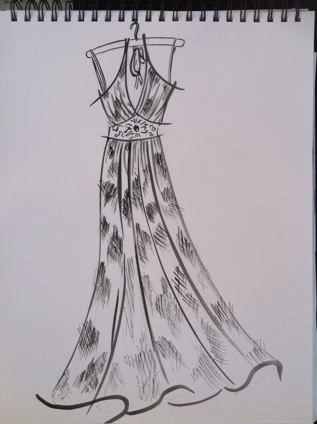
The collection that I have found myself most enthralled by is his  Pre-Spring 2017 collection. This collection was born out of a visit to Japan. The 1930s style is an era I particularly like. Erdem’s East meets West cross cultural feel is challenging on the eye and mind. flouncy floral maxi dresses sit along side military jackets and coats, these military pieces being embellished with flowers and jewels. ‘Make Love not war’ styling.

There are four particular aspects of this range that inspire me. 1;The bold floral embroideries and prints of blossoms and large blooms, there strong whites and blues against the backgrounds they sit onto.

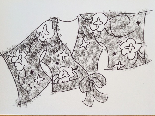
2; The tiny jewel details that embellish the collars and pockets adding femininity to what otherwise would be a masculine look.

 3, The embroidery of tiny flowers and blossom onto  leather. and number.

4; The repeat swirls of the daisy chain prints.

erdem-moralioglu

EXERCISE 1.7 Sources and Media

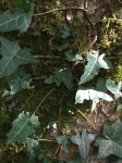
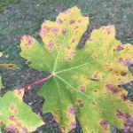
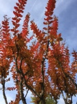
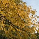
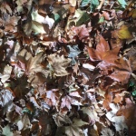
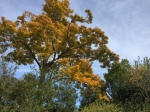
COLLECTING FLOWERS & LEAVES.

It all began with a walk in the woods after researching Tord boontje and being influenced by his description of how he came to design ‘Mid summer Light’ 

midsummer-pink

Midsummer Light.

http://shop.tordboontje.com

“Seeing sunlight coming through the leaves of trees during a walk inspired the Midsummer Light” ( Tord Boontje)

So I began also with a walk through the trees at a local Chateaux near to where I live. ‘Chateaux Beaulon’ Which has beautiful grounds and was perfect for my collecting of leaves

COLLECTING FLOWERS

DECIDING ON THE MEDIA

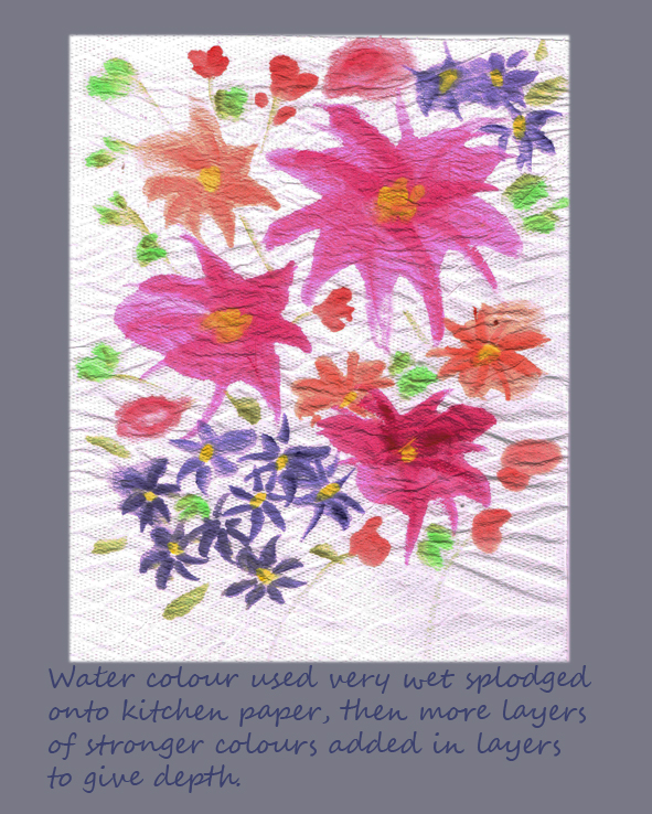
The media I have decided to use for this exercise is acrylic paint, watercolour paints and collage. I have also decided to experiment with digital Ipad art using the app ‘Procreate’.

I have chosen two colour palettes that I wish to work with:

Spring Summer

.ss-colour-palet

Autumn Winteraw-colour-palet

I also collected many pieces of fabrics and papers concentrating on the Spring/Summer colour palette for use in my collage.

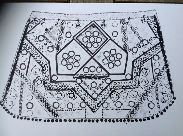
Reflecting back to drawing my archive textiles and after constructive feedback from my tutor I have chosen four pieces from my initial mark making/drawings which I feel that I would like to explore further and will include in my ten drawing at the completion of this project.  These I have chosen for their depth of texture even though they were produced using simple mark making I feel they were very effective.

Hazelnut leaves with Gouache      dress-3

Diagonal zigzags with depth and layers      img_6973

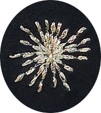
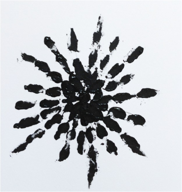
Starburst using cotton buds      star-stitch

Collage                img_7019

RESEARCH POINT 3

David Hockney.

I found the digitally  produced artwork of David Hockney’s the most interesting, his earlier works do not really appeal to me, however once I came to his digital artwork of Yosemite Park in America, and he drawing of Yorkshire these began to interest me. I found them vibrant and exciting to view. His Ipad artwork has introduced me to a whole new world of drawing and painting and having now downloaded the app ‘Procreat’ onto my own Ipad I am now converted if not a little bit addicted. I am not allowed to post any of Mr. Hockney’ images onto my log due to copyright. however you can see his work at http://www.hockneypictures.com

My attempt at Digital artimage

EXERCISE 1.8 Portraying by Drawing

For this project I have chosen to be experimental with mark making, choosing a lighter, less heavy approach that I have used previously.

  • I decided on two colour palettes to keep me focused, Spring/summer for the flowers and Autumn/winter for the leaves.
  • I looked to use and experiment with a wider variety of delicate paper and colour.
  • I have chosen two types of paint, acrylic and watercolour. Acrylics are good for stamping and achieving texture and watercolour are best to achieve a more delicate translucent appearance.
  • I have tried very hard to keep ‘black line’ to a minimum and looked to a softer and more delicate appearance.
  • I began to use digital art for the first time using the app ‘procreate’.

CONSOLIDATING MY FOLIO OF DRAWINGS

Laying out my work from the whole of Part One I have now chosen my ten pieces of work which I feel represent my journey through this project and are the strongest pieces which I would like to progress further with.

img_6973

star-stitch

dress-3

013a

012a

010

img_7019

Collage, ripped paper and ribbon.

001a

005a

WRITTEN REFLECTION

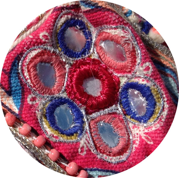
I initially chose my archive pieces because they all link together well visually, their connection being that they are all embellished pieces with each item being a mixture of   bead work and applique, delicate and soft in look yet mixed with a harsh and scratchy feel which comes from the lurex thread and sharp edges of the glass beads in complete contrast against the soft silk base of each archive piece. I felt this gave me a lot of scope for experimentation with mark making.

During mark making 1.3 I tried to portray the weight and texture of each item by various experimental mark making techniques. Out of the three pieces that I produced for 1.6 the ones I felt the most exciting to be were the quickest to produce, for example a cotton bud dipped into acrylic paint pressed down onto paper achieved the detailed embroidery stitch of a star like flower. I am very happy with this result.

During exercise 1.4 I began to explore the shape and form of my archive and I began to relax my approach towards drawing. Exercise 1.5, collage and creases, I found quite challenging, I spent a long time on my collage and it seemed a slow process but with the progression of the layers it started to take on a 3D appearance, and all of the tiny bits of paper which I had painstakingly ripped up became worthwhile.

Once I began project 3, picking and portraying, I feel my work begins to take on a rapid progression. Having researched the nine artists work in reference point 2, I chose three artists that I felt helped greatly in my choices of how to tackle this project. All of the artists made think about adding a lightness and prettiness to my work and to look more in depth at shape and form without using the harshness of black pen lines to define the piece. Also it helped me to evaluate shape, form and colour. Jane Askey influenced me on my choise of colour and how colour sits together. Tord Boontje, on simple pretty shape and form and Erdem, on bold yet very pretty florals.

This research has inspired me greatly in my approach to project 3. As I am a designer and not a fine artist by nature I have always worried that my abilities with perspective and technique has let me down. I am now beginning to realise that a personal interpretation, flow and colour are equally as important and I am starting to relax a little on my journey to finding my personal voice.

David Hockney and Katie Sollohub introduced me to digital drawing on the Ipad, and this has opened up a whole new and exciting avenue for me. My ‘drawing a day’ has begun and already I have began to notice a progression in my style. I also now use this method for notes and scribbled ideas.

PROJECT 1 SELECTING AND IDENTIFYING

PROJECT ONE. SELECTING AND IDENTIFYING

My definition of ‘Textiles’

In the broadest sense a textile is something that forms a function to either cover or protect, it is a collection of fibers linked together in some way to make a larger surface area, which can then be manipulated, cut, sewn or glued to serve its end purpose.

A textile is something that can be decorative or plain depending on its intended use whether it is to be industrial, domestic or medical. Fibers can be synthetic, natural, or animal derived.

I tended to think of textiles only in the sense of the decorative for home furnishing and fashion but after thinking further about this question “what is the definition of textiles” I find myself questioning many other products around me in my daily life that I take for granted…is the rubber seal around my car window a textile? It is after all made from fibre bonded together and manipulated. What about when broken arms used to be covered in plaster of Paris to mend them? The plaster set over crape bandage and molded, when this was taken off the arm it retained its shape and form. I think a Stone is not a textile, but once it has had a hole drilled through it and then liked with other stones by a thread or even wire, does it then become a textile? A plastic bag can be made into a coat, and so can many other materials that I wouldn’t think of as a textile. So the more I think about this question the more my thoughts blur and I can only say that I think I had better say I need to keep an open mind on this, and maybe come back to it quite a few times as my opinions develop during this course.

.Can Textiles have Stories and Narratives.

Yes, all textiles tell a story. I love second hand flea market buys, I am drawn to the texture that time shows in a fabric. I tend to buy linens and cottons and these so often show a history of whether they have been boxed away for best and over time yellowing at the folds or whether they have been used daily showing bobbles and sometimes a little careful mending. Vintage clothes tell fabulous stories of love affairs, tea dances, weddings and special days.

I don’t think I have anything in my home be it a lampshade, bag, a garment or a bed throw that doesn’t bring back a memory to me of where I bought, the year, what I was doing at the time.it or what I made it from. If I made it which is normally the case it usually had another life story before I cut it up and recreated it into something else. Most of the textiles in my house have at least nine lives. Here are two examples.

  •  Dining room curtains. The main bulk of the fabric I bought going cheap at a market, the fiber content is linen with an embroidery paisley pattern (probably originated from India). I intended to make it into curtains at my previous house before this one, but instead they remained in a bag and boxed away for a few years before I discovered the fabric again once I moved to France. There wasn’t quiet enough fabric for the size of curtains I needed for my windows so I cut up an old table cloth and added this, to create the length, the trim is hand made from China and imported about fifteen years ago for my fashion accessories practice and again has sat boxed away until now waiting to be re discovered.


  •  Patchwork quilt….still in the making. I discovered this quilt after my Mother passed away amongst her many sewing things and this patchwork tells so many stories! She started it back in the 1970s and it is made from entirely old bits of cotton dresses we both wore and also I recognise some of the designs from flower power ties my little brother had. He was about six and wore ties on elastic in bright pink and turquoise flower designs. Mum always made my dresses and I have memories of them all and the excitement of a matching headband was immense. The prints are of all colours and mainly flower designs, a real statement of the time. Each hexagon shape is hand stitched onto magazine cuttings which seem to mainly be from an old high way code book. It was around this time Mum was learning to drive,  believe it or not, not many women drove at this time. Each hexagon is then sewn to the next by hand and I remember her sitting sewing this in the evenings, no wonder she didn’t finish it with five children and growing all the vegetables, baking bread and cooking everything herself from Jam to Christmas cake on a solid fuel ‘Rayburn’. Looking back no wonder when at the age of ten I told her I was turning ‘Vegetarian’ she went mad!!I love this quilt, it tells a million stories of wear and tear of my childhood and my mothers life.

THE ARCHIVE  Exercise 1.1

I have decided to choose items for this project from my own archive. I have got boxes of fabric trims, bits of fabric and so many clothes it seemed only logical to take a closer more in-depth look at what I already have. I have chosen three items from my wardrobe, an evening gown a kimono top and a shoulder bag, each of these items is linked by the theme of embellishment and  layers of embroidery, bead work and applique.

img_6834


SUBSTANCE and STORY Exercise 1.2

EMBELISHED SHOULDER BAG

img_6861

  • It is made from a mixture of fibers. Printed cotton, leather, metal  zip , plastic mirror work, glass beads and lurex thread.
  • There is no label.
  • I remember buying it from ‘Accessorise’ 3 years ago.
  • I would hand wash this textile.

What methods have been used in its production?

  • This textile is woven and then embellished with applique, beadwork and embroidery.
  • It is hand-made although many of its components are machine made, the finishing embellishments such as the bead work is definitely hand finished as well as some of the embroidery. There is no identified maker.
  • The textile finishing methods that have been employed are, machine printing, hand embroidery, leather-work, hand bead-work
  • The textile ground is printed cotton and then it is completely covered in embellishment by hand and by machine.

Where is the textile from?

  • I would guess India is its manufacturing origin.
  • There is no manufacturing label.
  • It is not possible to be completely sure where the fabric is from.
  • I think the whole process of making this textile would have been done in India, from growing the cotton to the printing to the manufacturing of each component.

What problems y is important to be sure the fabric of origin is ethical and to be environmentally friendly.

  • For the missing information I could try an approach the design department directly at ‘Accessorise’ the company designed and manufactured this bag.

STORY

What other visual indications can you glean from closely examining the textile sample? If the textile has been made into a product, what can you learn from further visual examination?

  • This textile is well worn and heavily used.
  • The textile is durable and hard wearing
  • The age is of the textile is about 4 years old
  • There is lots of patina due to wear, not so much age. There are frayed edges and loose threads, the leather is worn in places and a few of the beaded embellishments are missing.
  • There is no evidence of repair or alterations.
  • I know the story behind the life of this textile because it has traveled everywhere with me. It is my dog walking bag, my going out shopping bag and my dressing up but feeling “Boho” bag. It is a happy well loved bag.

Are there any elements of the design, detail, decoration or construction of the textile sample that indicates a story behind the textile product? ( could this be the use of traditional motifs to t-shirt slogans)

  • There are no slogans or motifs used in the design of this textile.
  • This textile is designed to be transient.
  • This textile is personal to me as I love its vibrancy of colour and texture and that makes me happy.


EVENING GOWN

img_6846-3

SUBSTANCE

What is this textile made from?

What methods have been used in its production?

  • This textile is woven silk with lurex thread running through the silk to make a design. There is beadwork and embroidery.
  • It is a machine made textile with many embellishments such as the bead and jewel work hand finished. There is no identified maker other than it is designed by Sue Wong.
  • The textile finishing methods that have been employed are machine weaving and  machine embroidery,  hand bead/ jewel-work
  • the textile ground is silk.

Where is the textile from?

  • This garment was made in China.
  • There is a manufacturing label.
  • It is not possible to be completely sure where the fabric is from.
  • I think the whole process of making this textile would have been produced in China.

What problems have you encountered in trying to find out this information?

  • Traceability is important to be sure the fabric of origin is ethical and to be environmentally friendly.
  • By law, manufacturing origins and fiber contend and wash care labels must be added to a garment, these are all sewn into the lining of the dress so I had all the information I required.

STORY

What other visual indications can you glean from closely examining the textile sample? If the textile has been made into a product, what can you learn from further visual examination?

  • This textile is in nearly new condition.
  • The textile is delicate.
  • The age is of the textile is about 6 years old
  • There is only one sign of age and that is a single missing jewel from the centre embellished panel.
  • There is no evidence of repair or alterations.
  • This dress was bought from TK Max. I found it screwed up in a sorry state on the floor at the back of a rail. I cost me £34

Are there any elements of the design, detail, decoration or construction of the textile sample that indicates a story behind the textile product? ( could this be the use of traditional motifs to t-shirt slogans)

  • There are no slogans or motifs used in the design of this textile.
  • This textile is designed to be transient.
  • This Evening gown is personal to me as I love its vibrancy of colour and texture and the way the gold lurex shot through the silk hits the light and shimmers.


KIMONO TOP

img_6853


SUBSTANCE

What is this textile made from?

  • This garment is made from Silk.
  • There is a manufactures label stitched in to the lining of this garment.
  • I would dry clean this textile.

What methods have been used in its production?

  • This textile is woven and then embellished with applique, beadwork and embroidery.
  • It is machine made, the finishing embellishments such as the bead work is definitely hand finished as well as some of the embroidery and applique. There is no identified maker.
  • The textile finishing methods that has been employed is weaving and dying of the silk,  hand embroidery, hand bead-work, hand applique.
  • The textile ground is dyed silk and then it is embellishment by hand and by machine.

Where is the textile from?

  • I would guess China is its manufacturing origin.
  • There is no country of origin manufacturing label.
  • It is not possible to be completely sure where the fabric is from.
  • I think the whole process of making this textile would have been produced in China.

What problems have you encountered in trying to find out this information?

  • Traceability is important to be sure the fabric of origin is ethical and to be environmentally friendly.
  • For the information missing, I feel it would be impossible to trace where exactly this textile was made as it is now at least 14 years old, I can only guess by using my past experience of manufacturing in the fashion trade.

STORY

What other visual indications can you glean from closely examining the textile sample? If the textile has been made into a product, what can you learn from further visual examination?

  • This textile is in nearly new condition.
  • The textile is delicate.
  • The age is of the textile is about 14 years old
  • The only wear and tear is one or two missing beads.
  • There is no evidence of repair or alterations.
  • This garment was bought by me from Harvey Nichols around 14 years ago.

Are there any elements of the design, detail, decoration or construction of the textile sample that indicates a story behind the textile product? ( could this be the use of traditional motifs to t-shirt slogans)

  • There are no slogans or motifs used in the design of this textile.
  • This textile like all fashion is designed to be transient, except that when I buy something  I tend to keep it forever and sometimes give it a new life into something else after wearing it several times.
  • It is personal to me as I love its.

Nostalgia is a recurring theme in textiles and within the broader sphere of design and art. Textiles have special role play, as we can attach memories, experiences and sensations, particularly to wearing of textiles or there close proximity.

I feel a great sense of nostalgia about the three items that I have chosen but I am like that about everything I own. I collect and hang on to everything, be it clothing, beads or furniture in my home. I just connect with things that make me feel good and I make a conscious effort to part with anything that doesn’t make me feel emotionally happy.It was a very conscious decision to choose these textile for my my three items as each piece has so many elements of visual interest,wear and tear, colour and texture.

All three items I have chosen have a sense of heritage, they have all three been with me to many an evening out and are full of memories of parties, friends, food and wine!


PROJECT 2 RECORDING & CAPTURING

MAKING MARKS Exercise 1.3

THE BAG.

image
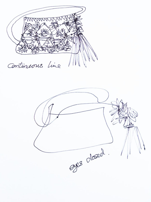
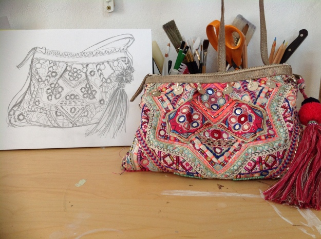
This is my first mark making drawing of ‘The Bag’ I wanted to capture its dumpy, plonked down on the table appearance along with capturing its well loved and worn texture. It was a quick sketch and quite scribbly made with using just a simple graphite 3b  pencil onto 160grm white paper.

image

For the first stage of this drawing I used only items that would make texture, I sketched out a simple outline for a guide and then made marks using Gouache. I used a stamp technique and for the different marks, I used different stamps which I had made, each giving a different texture.The tools used to make the marks are..Lace ribbon, buttons, bent card into a small V shape, bottle top, small coin, edge of a cork plate stand and a sponge.image

Once the marks were in place I then added black line using marker pen to give definition.image

For the tassel on the bag I used ornamental grass dipped in  gouache paint and then pressed this down onto the paper. the pom-pom was achieved by scrunching up cotton threads, dipping them into paint and the little beads were made using the tip of a cotton bud again dipped into paint and pressed down.bag-3


EVENING GOWN

Quick fluid, flowing, soft, scratchy, billowing.. strokes of the brush were used to capture the flow and swish of the Evening Gown, the soft floaty silk billowing out from the tight gathers of the waist. I used watercolour paint onto plain sketch paper. For the lurex which is shot through the silk I used small twigs dipped into the paint, I wanted a scratchy feel as the gold lurex is quite harsh and sturdy in comparison to the soft silk.image

Diagonal, zig-zag, depth, layers…To produce the feel of the silk showing the lurex design I made jagged zig-zag marks for the outline using a hard graphite 2b pencil onto watercolour paper 360grm I then washed the background with individual strokes of the brush using watercolour paint. For the graphite and paint I tried to keep all of the lines and strokes moving in an individual diagonal line to depict the silk of the gown being cut on the bias.img_6973

Delicate, scratchy, layered…For the folds of silk I used water colour paint washed onto water colour paper.  For the design of the lurex running through the silk I used the back of hazel nut leaves painted with gouache and stamped down over the water colour wash, these are quite rough and scratchy leaves, similar in texture to the lurex itself.dress-3

THE KIMONO

Flat, heavy, matt…I used solid blocks of gouache paint to capture the heavy drape and  weight of the kimono.kimono-2

Matt, coarse, shiny, scratchy….Sponged water colour paint onto watercolour paper to show the feel of the matt silk leaving the applique of the flowers without detail showing the contrast between the matt of the base textile and the satin sheen of the appliquekimono-3

Heavy, chunky, solid, zig-zig.. I drew the outline of the applique using black marker pen. There is nothing delicate about the appearance of the beadwork or the applique on the Kimono. I wanted this to come across in the heavy black zig-zag lines.kimono-1

LINES & EDGES Exersise1.4

The Bag:

11

9-10

6-8

THE DRESS

543

THE KIMONO

2112

COLLAGE & CREASES Exercise 1.5

I decided I wanted to work  my bag for this project, it has so many interesting textures and layers and I was ready to work with some bright vibrant colour!

I made most of my papers digitally by choosing elements of the textile that appealed to me the most, I then enlarged theses and pulled out elements of interest. Because of the digitally enlarged areas I was able to exaggerate the surface of the weave and texture also. I then chose four of the main colours and printed of colour blocks of these.

All these digital papers were then torn and shredded along with other cards and papers I had collected, with a couple of ribbons also added.

A Simple colour block of the overall shape of the bag ,picking out the predominant colours along with gold and silver. I wanted the lines to be solid and diagonal to represent the angles within the surface design of the bag.img_7020

This was the fun part, I ripped and shredded as many layers as possible to attempt to achieve a 3 dimensional image to my 2 dimensional collage.img_7019

RESEARCH POINT 1        

WABI-SABI.    Pare down the essence but don’t remove the poetry. ( Koren,2008,p.27)


Research Point 1

“Finding  beauty in imperfection, patina, authenticity, harmony and  simplicity”.

Wabi, meaning finding simplicity, freshness or quietness within natural or manmade objects or understated elegance.

Sabi, meaning Beauty or serenity, quirks and anomalies which add a unique elegance to an object.

Legend= Sen no Rikyu whilst learning the art of the custom of the ‘Tea way’ was asked by his master to rake and tidy the gardens, once the garden was cleared of all debris he then stood back and scrutinized the perfect ground, before showing his work to his master he shook a cherry tree allowing all the bloom and petals to fall to the floor. To this day the Japanese revere Rikyu for his understanding to his very core of the thread known as Wabi-sabi.

For me Wabi-sabi is about finding beauty in the used imperfections of an object or place and I think maybe  even a memory too, and excepting these imperfection have there right to be there. Beauty is not ‘perfection’ but a sense of being in its own right a sense of peace.My home my garden my textiles and just about everything around me has a sense of Wabi-sabi.I was not familiar with this concept before this research project, I now find that it is a concept that has been with me all my life, there is a faded, frayed and weathered appeal that I find all around me. Peeling sun-bleached  paint on the shutters of my house, crumbling stone work, rusty iron gates, furniture that I have bought second hand and re painted giving it new life, but still showing the chips and bumps of time. These imperfections are all aspects I except happily, they are “The Charm” the very essence of my love for them.


The natural acceptance of Wabi-Sabi is one that enables me to see the beauty in imperfection and accept that, on this textile journey I will make mistakes whilst mark making, sewing and designing but these mistakes have a place too and may just lead to the creation of something beautiful.

The concept of wabi-Sabi is one that is incredibly relevant with keeping an archive, it helps to tell the history behind the textile through it patina and imperfections, who wore it, how it was cared for, was it loved and neatly folded away in a draw or discarded crumpled at the bottom of a box, the bobbles on a sweater showing how much it was worn, moth holes and cosmetic smudges, deodorant stains and stale perfume are all part of a textiles history.

Reference

http://www.wikipedia.org.

http://www.UTNE.com/wabi-sabi the art of imperfection

http://www.wholeliving.com/wabisabiyourlife

http://www.touchingstones.com/learingtoseethe invisible

Leonard Korens book


DETAILS & DEFINITION Exersise 1.6


This small section of beadwork on the evening gown despite its curved shape it is angular and sharp to the touch, I wanted to portray this in the detail by using sharp oblong marks, for the small outer line of glass beads which are smooth to the touch, I used the soft tip of a marker pen.


beadsbeadwork-1

The mirror work on this textile is quite worn and frayed, the stitches are all different, some tight together and some further apart, I used fine marker pen to depict the stitches and used light coloured pencil to try and give the depth and roundness of the raised embroidery.

untitled-1img_7023

This tiny Starburst of gold lurex I wanted to show enlarged to 8cm the original is only 3cms across. I used acrylic paint as I wanted a chunky feel to the embroidery and I used a cotton bud to achieve this by dipping it into the paint and then laying it length ways to depict the stich work.

gold-embroidered-star-burststar-stitch